居中布局
水平居中
table + margin
1
2
3
4
| .child {
display: table;
margin: 0 auto;
}
|
inline-block + text-align
1
2
3
4
5
6
| .parent {
text-align: center;
}
.child {
display: inline-block;
}
|
- 优点:兼容性非常好,虽然
inline-block在 IE6 和 IE7 中不支持,但是可以通过其他的方法来模拟。
- 缺点:子元素会继承父元素的
text-align:center,子元素的内容也会是text-algin:center的。
display:table的元素表现上跟display:block比较像,但是它的宽度是根据内容决定的。
- 优点:只要设置 child 即可。
display:table在 IE8 以上的浏览器都是支持的。
1
2
3
4
5
6
7
8
| .parent {
position: relative;
}
.child {
position: absolute;
left: 50%;
transform: translateX(-50%);
}
|
- 优点:子元素不会对其他元素产生影响
- 缺点:兼容性,因为
transform是 CSS3 新增的。
flex + justify-content/margin
1
2
3
4
5
6
7
| .parent {
display: flex;
justify-content: center;
}
|
垂直居中
table-cell + vertical align
1
2
3
4
| .parent {
display: table-cell;
vertical-align: middle;
}
|
1
2
3
4
5
6
7
8
| .parent {
position: relative;
}
.child {
position: absolute;
top: 50%;
transform: translateY(-50%);
}
|
flex + align-items
1
2
3
4
| .parent {
display: flex;
align-items: center;
}
|
水平和垂直同时居中
inline-block + text-align + table-cell + vertical-align
1
2
3
4
5
6
7
8
| .parent {
text-align: center;
display: table-cell;
vertical-align: middle;
}
.child {
display: inline-block;
}
|
1
2
3
4
5
6
7
8
9
10
| .parent {
position: relative;
}
.child {
position: absolute;
left: 50%;
top: 50%;
transform: translateX(-50%);
transform: translateY(-50%);
}
|
flex + justify-content + align-items
1
2
3
4
5
| .parent {
display: flex;
justify-content: center;
align-items: center;
}
|
多列布局
定宽与自适应
float + margin
1
2
3
4
5
6
7
| .left {
float: left;
width: 100px;
}
.right {
margin-left: 120px;
}
|
1
2
3
4
5
6
7
8
9
| <div class="parent">
<div class="left">
<p>left</p>
</div>
<div class="right">
<p>right</p>
<p>right</p>
</div>
</div>
|
- 缺点:在 IE6 及以下的浏览器中,因为右边的元素是没有浮动的,而左边的元素是浮动的,会有一个历史遗留的 bug,导致 right 元素的文字会有 3px 的缩进。而且在对右边的元素清除浮动时,也会带来一些问题。于是就有了下面这个方法:
float + margin + (fix)
1
2
3
4
5
6
7
8
9
10
11
12
13
| .left {
float: left;
width: 100px;
position: relative;
}
.right-fix {
float: right;
width: 100%;
margin-left: -100px;
}
.right {
margin-left: 120px;
}
|
1
2
3
4
5
6
7
8
9
10
11
| <div class="parent">
<div class="left">
<p>left</p>
</div>
<div class="right-fix">
<div class="right">
<p>right</p>
<p>right</p>
</div>
</div>
</div>
|
- 备注:因为右元素的层级高于左元素,右边的元素会遮盖左边的元素,导致某些事件无法被触发,所以需要对左元素设置
position: relative;。
- 优点:不会存在 IE6 下那个 3px 的问题,也不会存在清除浮动的问题。
- 缺点:结构比较复杂一些。
float + overflow
1
2
3
4
5
6
7
8
| .left {
float: left;
width: 100px;
margin-right: 20px;
}
.right {
overflow: hidden;
}
|
1
2
3
4
5
6
7
8
9
| <div class="parent">
<div class="left">
<p>left</p>
</div>
<div class="right">
<p>right</p>
<p>right</p>
</div>
</div>
|
table
1
2
3
4
5
6
7
8
9
10
11
12
13
| .parent {
display: table;
width: 100%;
table-layout: fixed;
}
.left,
.right {
display: table-cell;
}
.left {
width: 100px;
padding-right: 20px;
}
|
- 备注:table 布局的一个特点是,所有列的宽度之和一定等于总和
flex
1
2
3
4
5
6
7
8
9
10
| .parent {
display: flex;
}
.left {
width: 100px;
margin-right: 20px;
}
.right {
flex: 1;
}
|
- 缺点:兼容性问题,flex 在 CSS3 中才被支持;因为自适应带来的性能问题(只能用来做小范围的布局)
不定宽与自适应
不定宽指的是:不指定宽度,可以是任意宽度,或者也可以是,宽度是由内容决定的。
float + margin
1
2
3
4
5
6
7
8
| .left {
float: left;
margin-right: 20px;
}
.right {
overflow: hidden; //block formatting context
}
|
table
1
2
3
4
5
6
7
8
9
10
11
12
13
| .parent {
display: table;
width: 100%;
table-layout: fixed;
}
.left,
.right {
display: table-cell;
}
.left {
width: 0.1%;
padding-right: 20px;
}
|
flex
1
2
3
4
5
6
7
8
9
| .parent {
display: flex;
}
.left {
margin-right: 20px;
}
.right {
flex: 1;
}
|
等分布局
float
1
2
3
4
5
6
7
8
9
| .parent{
margin-left: -20px;
}
.column{
float: left;
width: 25%;
padding-left: 20px;
box-sizing: border-box;
}
|
1
2
3
4
5
6
| <div class="parent">
<div class="column"><p>1</p></div>
<div class="column"><p>2</p></div>
<div class="column"><p>3</p></div>
<div class="column"><p>4</p></div>
</div>
|
- 备注:存在的一个问题是,这种方法无法根据列数来变化
table
1
2
3
4
5
6
7
8
9
10
11
12
| .parent-fix{
margin-left: -20px;
}
.parent{
display: table;
width: 100%;
table-layout: fixed;
}
.column{
display: table-cell;
padding-left: 20px;
}
|
1
2
3
4
5
6
7
8
| <div class="parent-fix">
<div class="parent">
	<div class="column"><p>1</p></div>
	<div class="column"><p>2</p></div>
	<div class="column"><p>3</p></div>
	<div class="column"><p>4</p></div>
</div>
</div>
|
flex
1
2
3
4
5
6
7
8
9
| .parent{
display: flex;
}
.column{
flex: 1;
}
.column+.column{
margin-left:20px;
}
|
1
2
3
4
5
6
| <div class="parent">
<div class="column"><p>1</p></div>
<div class="column"><p>2</p></div>
<div class="column"><p>3</p></div>
<div class="column"><p>4</p></div>
</div>
|
等高布局
同行的多个元素,保持相同高度。
table
1
2
3
4
5
6
7
8
9
10
11
12
| .parent {
display: table;
width: 100%;
table-layout: fixed;
}
.left, .right {
display: table-cell;
}
.left {
width: 100px;
padding-right: 20px;
}
|
1
2
3
4
5
6
7
8
9
| <div class="parent">
<div class="left">
<p>left</p>
</div>
<div class="right">
<p>right</p>
<p>right</p>
</div>
</div>
|
flex
1
2
3
4
5
6
7
8
9
| .parent{
display: flex;
}
.left{
margin-right: 20px;
}
.right{
flex: 1;
}
|
- 备注:因为
flex布局,默认的align-items是stretch。所以就产生了等高的特性
float
1
2
3
4
5
6
7
8
9
10
11
12
13
14
| .parent {
overflow: hidden;
}
.left{
padding-bottom: 9999px;
margin-bottom:-9999px;
}
.left{
float: left;
margin-right: 20px;
}
.right{
overflow: hidden;
}
|
全屏布局
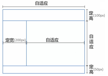
position
1
2
3
4
5
6
| <div class="parent">
<div class="top">top</div>
<div class="left">left</div>
<div class="right"><div class="inner">right</div></div>
<div class="bottom">bottom</div>
</div>
|
1
2
3
4
5
6
7
8
9
10
11
12
13
14
15
16
17
18
19
20
21
22
23
24
25
26
27
28
29
30
31
32
33
34
35
36
37
38
39
40
41
42
43
44
45
46
47
48
49
50
51
52
| html, body, .parent
{
overflow: hidden;
height: 100%;
margin: 0;
}
body
{
color: white;
}
.top
{
position: absolute;
top: 0;
right: 0;
left: 0;
height: 100px;
background: blue;
}
.left
{
position: absolute;
top: 100px;
bottom: 50px;
left: 0;
width: 200px;
background: red;
}
.right
{
position: absolute;
top: 100px;
right: 0;
bottom: 50px;
left: 200px;
overflow: auto;
background: pink;
}
.right.inner
{
min-height: 1000px;
}
.bottom
{
position: absolute;
right: 0;
bottom: 0;
left: 0;
height: 50px;
background: black;
}
|
flex
1
2
3
4
5
6
7
8
| <div class="parent">
<div class="top">top</div>
<div class="middle">
<div class="left">left</div>
<div class="right"><div class="inner">right</div></div>
</div>
<div class="bottom">bottom</div>
</div>
|
1
2
3
4
5
6
7
8
9
| html,body,.parent{margin:0; height:100%; overflow:hidden;}
body{color: white;}
.parent{display: flex; flex-direction: column;}
.top{height:100px; background: blue;}
.bottom{height:50px; background: black;}
.middle{flex:1; display:flex;}
.left{width:200px; background: red;}
.right{flex: 1; overflow: auto; background:pink;}
.right .inner{min-height: 1000px;}
|
